Russian Aeroflot launches rebranding
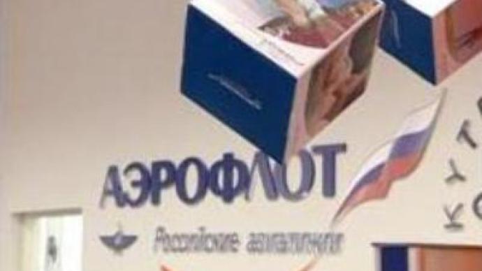
One of Russia's most recognizable brands Aeroflot airlines has hired foreign advertising agencies to develop its brand and to brush up its image. The company keeps its historic Soviet-era name and logo.
The Aeroflot brand has a long history. The logo – the hammer and sickle with wings – symbolising the victory of the Soviet Union over its air space, appeared in 1932. No one bothered about the message of the brand until after the collapse of the Soviet Union when competition appeared on the market. It turned out that people associated the brand with bland food, rude flight attendants and rattling jets. Aeroflot hired foreign advertising agencies to fix that.Agencies offered Aeroflot two strategies – a revolutionary one – radically changing the name and the logo of the company – or a simple restyle of the existing one.“Before the rebranding Aeroflot had already renewed its fleet and significantly improved the quality of its service, but the passengers did not get the message and had the same Soviet-era image of Aeroflot in their minds. That is why we decided to restyle the logo and develop new colour livery for the aircraft. And in our advertising campaign we highlighted the fact that Aeroflot is now a client oriented airline,” said Oleg Volkosh, Head of Media Arts Agency. In 2004, the airline launched a massive advertising campaign with a message that Aeroflot is a client oriented company. The campaign successfully increased brand loyalty.With the minds of Russian clients apparently conquered, Aeroflot faces a new challenge – to become recognisable on the foreign market.And here there is a question – is the old Soviet-era logo the right key to clients’ hearts in Europe and the U.S.?“What really matters for European and American passengers is the product the airline provides. So we do not think that a Soviet style logo will be perceived negatively abroad. A lot of time has passed since the Soviet Union. Now the main thing on the market is the product,” Oleg Volkosh noted. Indeed as generations are growing, the connection of Aeroflot with the Soviet Union era is blurring. Another Russian airline, Sibir, followed a more radical way in developing its brand. Colourful aircraft with S7 logo appeared in Russian and international airports. Advertising experts say the brand became more modern and emotional but lost its roots. Besides it is difficult to articulate – “S seven”.
You can share this story on social media:
Follow RT on