From New York to Los Angeles: Interactive map breaks down US wealth gap (IMAGES)
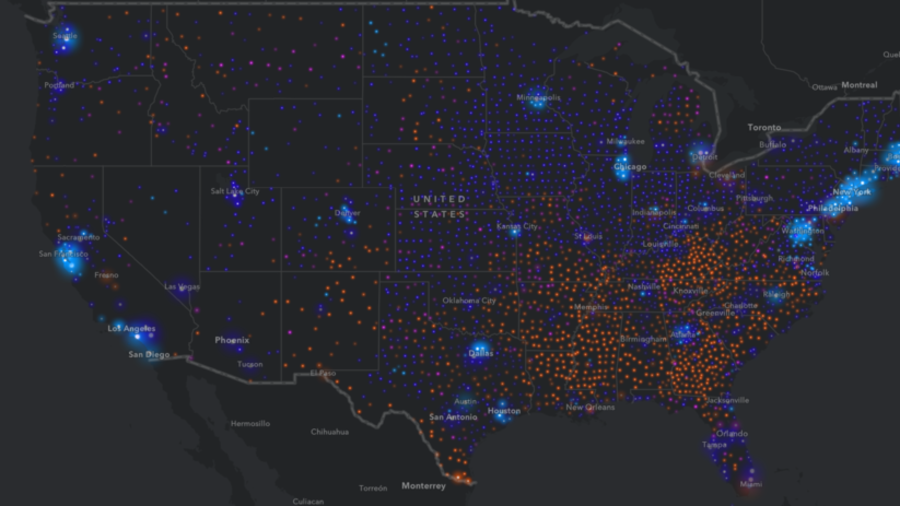
The stark disparity in household income between US cities and rural areas has been laid bare in a new interactive map. Designers at mapping software firm Esri used census data to create a granular breakdown of US income disparity.
The results show that wealth is concentrated in cities, though within those cities there are vast disparities between household income in different areas. “Middle America is firmly middle class, while large, primarily rural swathes of the south remain mired in poverty,” Esri said.
READ MORE: America's richest 1% owns 40% of country's wealth - study
In most southern counties, over a quarter of households earn less than $25,000 dollars. Esri images also show the vast differences in wealth between areas within the cities of Los Angeles, Detroit and New York.
The maps are categorized by average income per household, per year. Red dots represent areas where the average income is less than $25,000. Pink marks areas where it is between $25,000 and $50,000. Purple is between $50,000 and $100,000. Meanwhile, blue represents households that earn over $100,000 per annum. The larger the dot, the greater the concentration of households earning the corresponding amount of money.
“Nationwide, approximately 22.3 percent of households earn less than $25,000 each year. Conversely, about 24.6 percent of households earn at least $100,000 per year,” the firm said, adding that the disparity is repeated across the US.
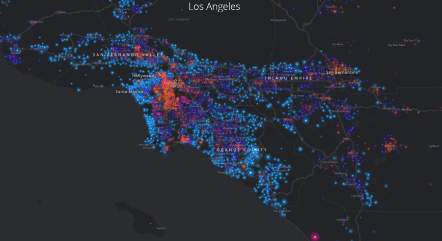
Los Angeles
Wealthy households make up most of the coastal areas and hills of LA, whereas the poorer areas are densely concentrated in the downtown area of the sprawling metropolis. Middle-class areas make up large parts of Orange County to the south-east, the Inland Empire to the east and the San Fernando Valley to the north-west.
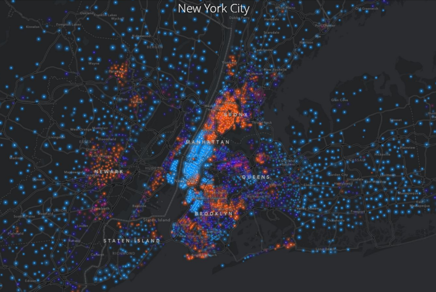
New York City
The city is characterized by a stark divide in income between the various boroughs. Manhattan is overwhelmingly wealthy, while the Bronx remains under privileged. The data shows a number of middle-class enclaves located in Brooklyn, Staten Island and Queens. Rapid gentrification has raised income levels in certain areas, with Brooklyn in particular displaying greater income diversity than other areas of the city.
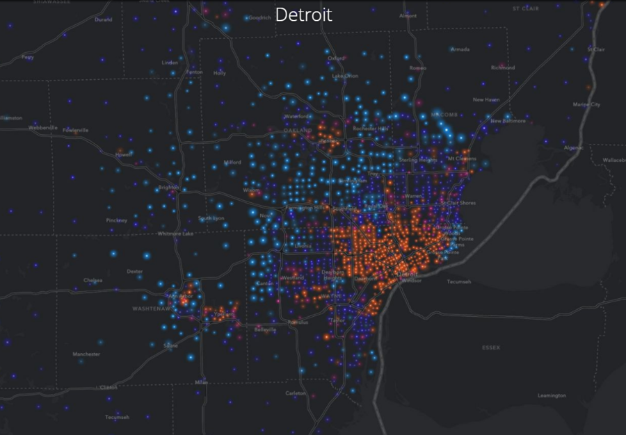
Detroit
Detroit, the home of America’s declining car manufacturing industry, suffered devastating job losses throughout the seventies and eighties. Some recent media reports have claimed a renaissance is underway in the former motor city, but as this map illustrates, the resurgence appears confined to the city’s outskirts. The city center is still firmly below the poverty line – more than 250,000 residents live below this line.
Like this story? Share it with a friend!