British designers create typographic tribute to cities affected by World War II
Designers Liam + Jord have created a series of minimalistic history-inspired “logos” for cities affected by World War II as part of RT’s tribute project #VictoryPages featuring cities such as Moscow, Warsaw, Berlin, and Hiroshima.
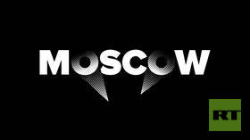
Anti-aircraft floodlights were an integral part of Moscow’s defense system in the first year of the Great Patriotic War – 1941 – when Nazi Germany invaded the USSR. More than 600 floodlight installations were installed and helped protect the capital from German air raids.
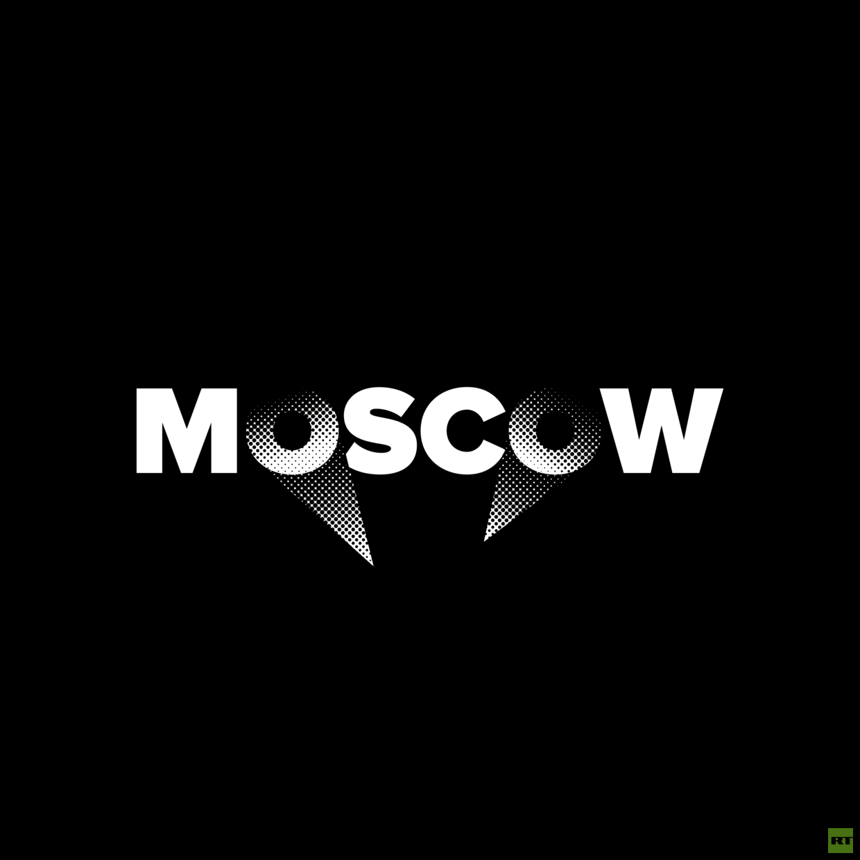
“Moscow defended itself during the war using immensely powerful searchlights that illuminated the entire sky. The purpose of this was to obscure itself against potential aviation attacks.” Liam & Jord say.
“This graphical representation is in recollection of that, using two stylized light beams being directed at the text. The way the light affects the legibility of the individual letters and in turn, the whole word, is in direct correlation with the objective of the searchlights in Moscow,” the designers explain.
The Battle of Kursk is considered the largest tank battle in history – thousands of military vehicles took part in it with 70% of Soviet tanks being the legendary T-34. It was a major turning point for the Soviet Army, which gained a platform to start a counter-offensive against Nazi Germany.
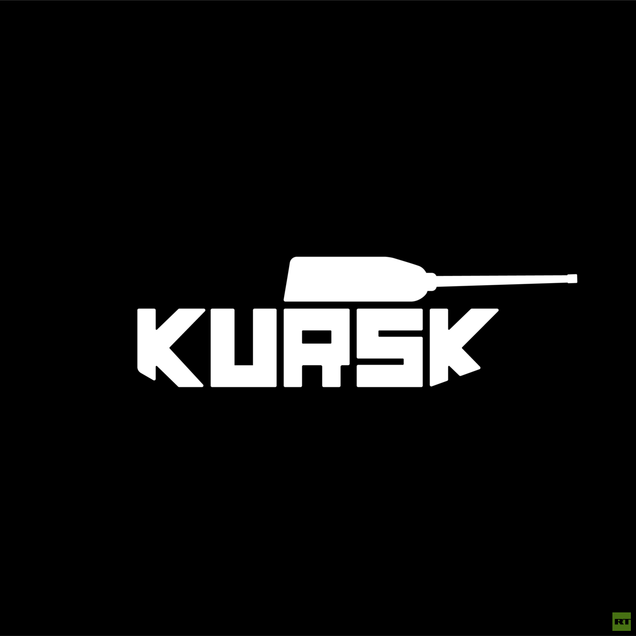
“The Model T-34 tank played a pivotal role in the city’s defense, and later on the entire conflict of the Eastern Front,” Liam & Jord say, who used a T-34 tank for Kursk’s image.
The Germans began their push against the Soviet forces near the city of Kursk, around 500 kilometers southwest of Moscow, in July 1943. But receiving early warning from the intelligence services about the upcoming attack, the Soviets reinforced their positions – resulting in a showdown with over 8,000 tanks, 5,000 planes, and 3 million soldiers involved on both sides.
Despite the Germans’ determined advance, the Soviet forces managed to reverse every gain, using the famous T-34 main battle tanks and IS-2 heavy tanks, as well as Katyusha multiple rocket launchers. The Red Army was about to go on the offensive when Hitler called off his forces on hearing that US troops had landed in Sicily.
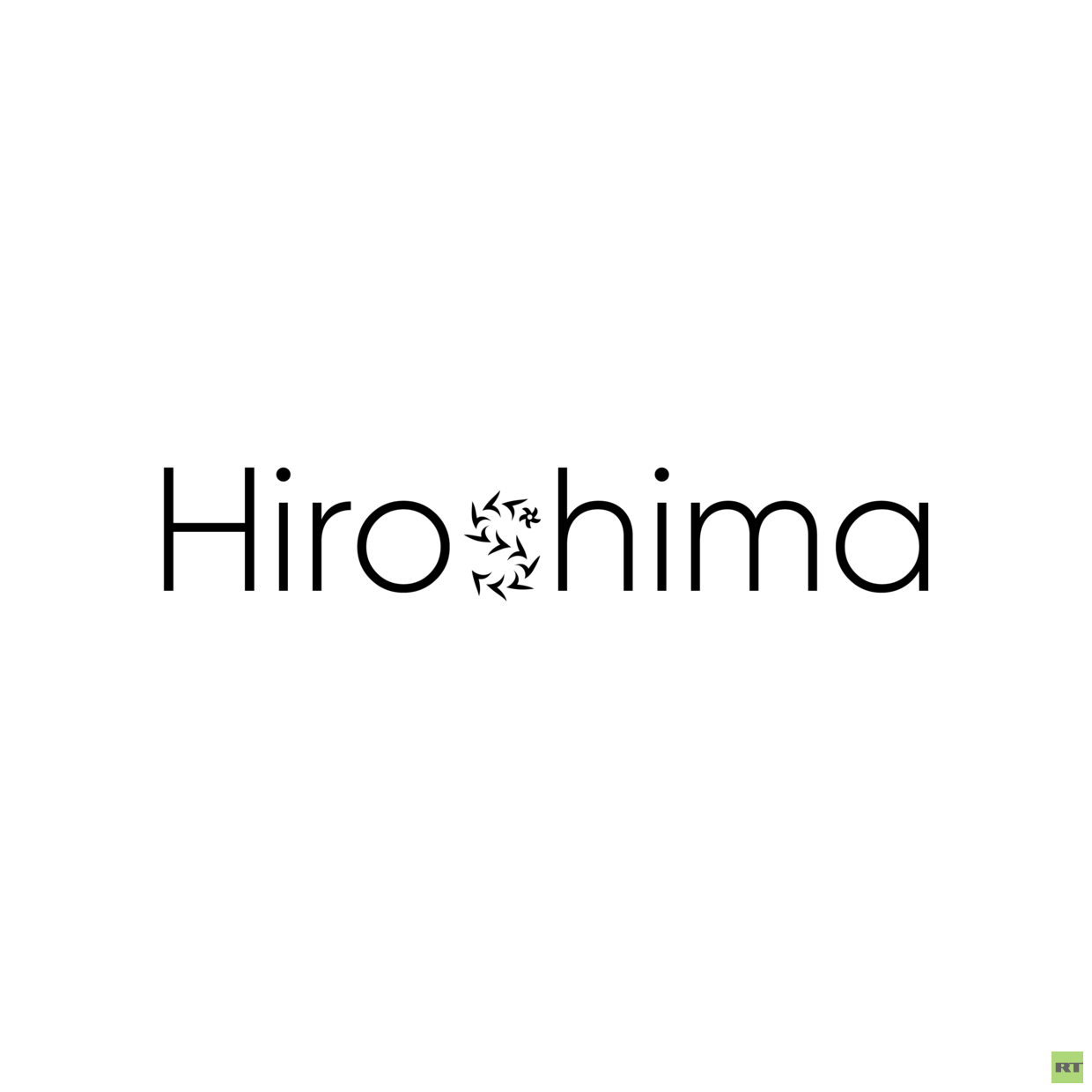
Liam & Jord’s take on Hiroshima is less blunt. Instead of playing on any images resembling a nuclear explosion, they send a message of peace:
“A reminder of the atrocities of nuclear weapons, yet an adored symbol of resilience and hope. The Oleander was the first to bloom on the scarred remains of Hiroshima, the official flower of the city, risen from the ashes.”
This typographic tribute features the Oleander flower as a symbol of life and peace following war.
Previously, through kinetic typography, the designers created a series of animations for the project’s signature font ‘May’. Kinetic typography is an animation technique mixing motion and text to express ideas using video animation.
Using a combination of the unique font especially created for #VictoryPages from inscriptions that Soviet soldiers left on the Reichstag building in the spring of 1945, and contemporary art, Liam + Jord animated a series of legendary statements about World War II and the feat of the soldiers to create a kind of digital hall of fame for the fallen.
The font is unique in its apparent handwritten style as well as its variability – each letter has several alternative forms between which you can switch when typing, while the letters themselves are arranged in lines slightly unevenly, as if written on a wall. You can try or download the ‘May’ font from the project’s website HERE.
The typographic tribute is part of a larger endeavor: #VictoryPages, a versatile documentary project playing out over five social media platforms. It offers an opportunity to look at the historical magnitude of May 9, 1945 through the personal impressions of our contemporaries on Facebook, YouTube, VK, Twitter and Instagram.